Instructor · Stages 2–3 (~25 min combined). Render and open the HTML. Walk through EDA first (Stage 2, ~10 min) then the tidymodels section (Stage 3, ~10 min). Key narration cues are marked 💬 throughout.
🔍 Stages 2 & 3 · Read the Evidence · Model the Pattern
A reproducible analysis keeps code and conclusions in the same file. Every number, every chart, every model update is one render away.
💬 “glimpse() is the first thing I run on any dataset. It tells me variable types, dimensions, and a data preview in a compact format — faster than scrolling through Excel.”
💬 “Summary statistics are the first conversation with your data. Look for min/max outliers, and notice whether the mean and median are close — a big gap hints at skew.”
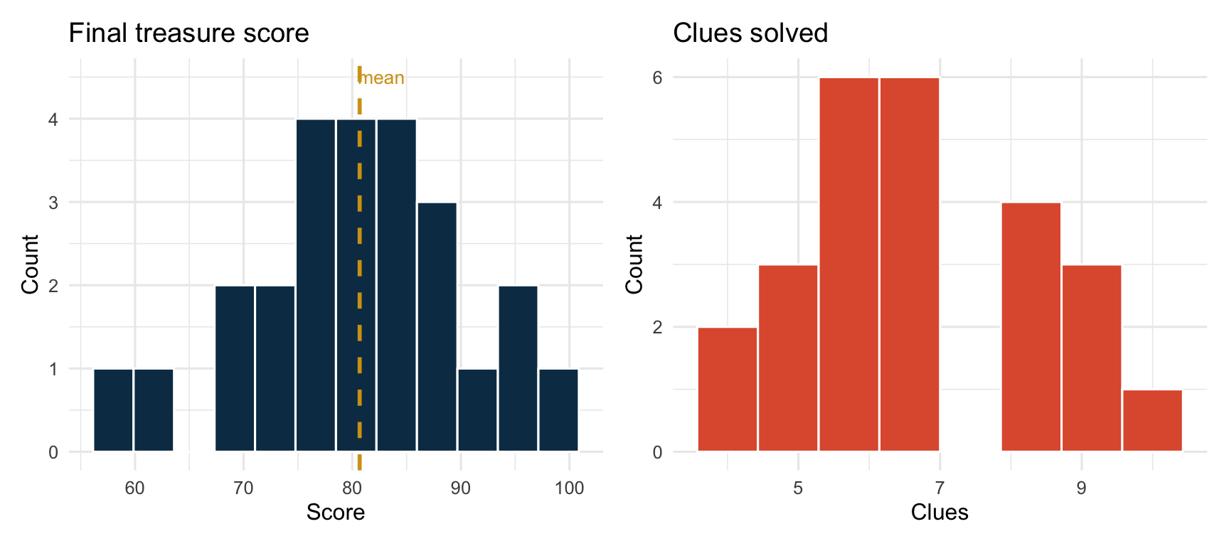
Distribution of final treasure scores (left) and clues solved (right)
💬 “The dashed line is the mean. Is the distribution roughly symmetric or skewed? Skew affects which summary statistic is most meaningful.”
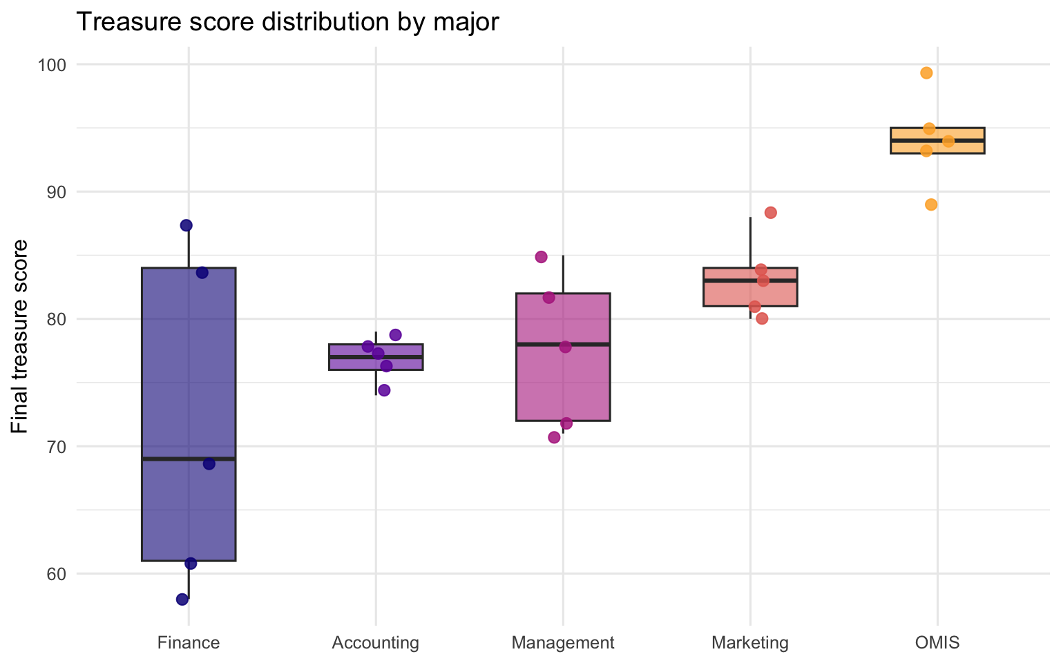
1.4 Score distribution by major
Code
treasure |>ggplot(aes(x = major, y = final_treasure, fill = major)) +geom_boxplot(alpha =0.6, outlier.shape =NA, width =0.5) +geom_jitter(aes(colour = major), width =0.12, size =2.5, alpha =0.85) +scale_fill_viridis_d(option ="plasma", end = .82) +scale_colour_viridis_d(option ="plasma", end = .82) +labs(title ="Treasure score distribution by major",x =NULL, y ="Final treasure score" ) +theme_minimal(base_size =12) +theme(legend.position ="none")
Treasure score by major — dots show individual teams
💬 “Box plots show spread and median. The jittered dots show every individual team. Ask: which major has the highest median? Which has the most variability?”
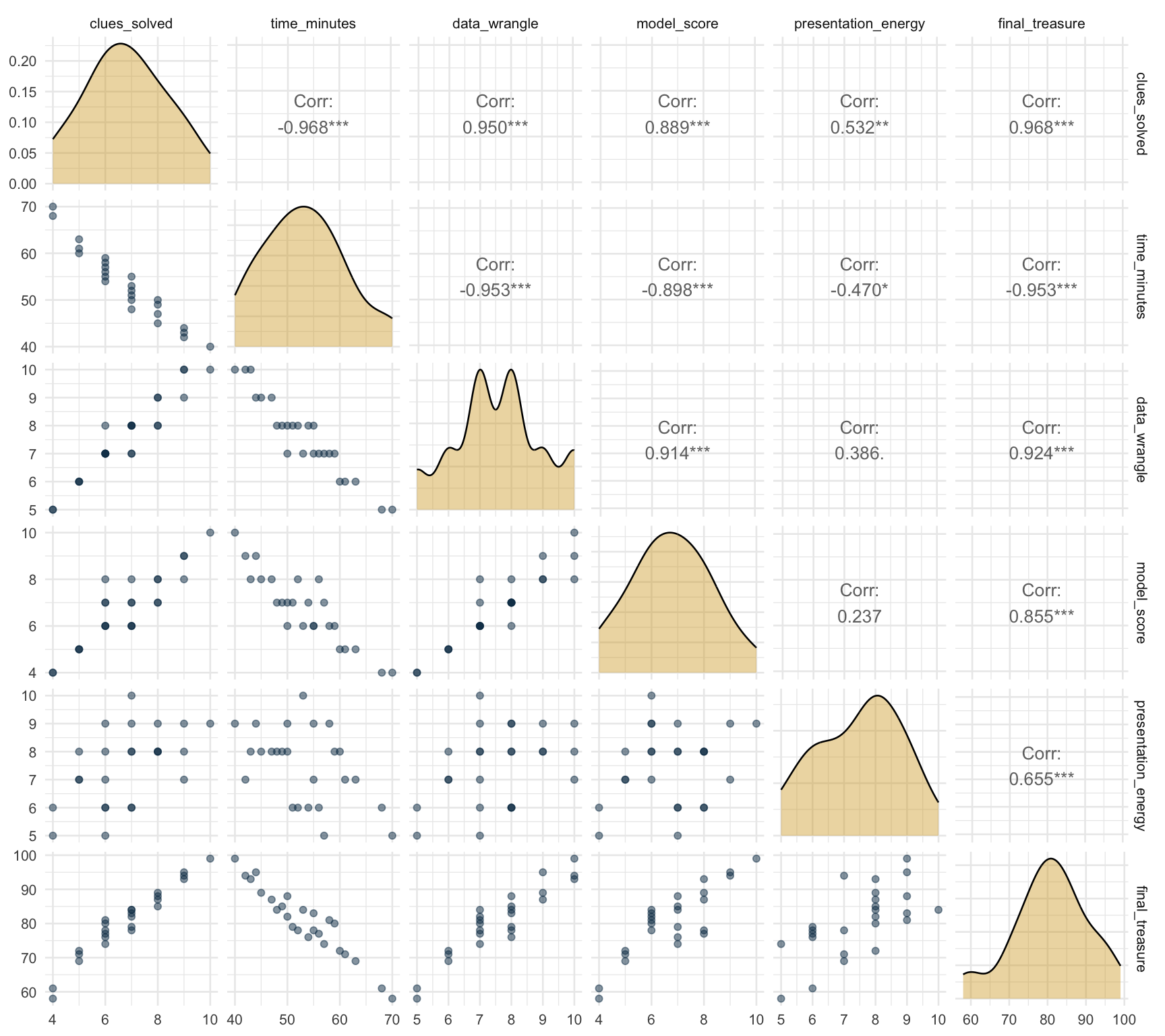
Pair plot: correlations and scatterplots for all numeric features
💬 “The pair plot shows everything at once: histograms on the diagonal, scatter plots below, correlation coefficients above. The strongest predictors of final_treasure are immediately visible.”
🏴☠️ Fragment #2: The practice of keeping code and conclusions together so neither ever drifts from the other is called reproducible analysis.
2 Stage 3 · Tidymodels — Fit + Diagnose
2.1 The tidymodels workflow
Every tidymodels pipeline follows the same chain:
split → recipe → model spec → workflow → fit → predict → evaluate → diagnose
What makes it powerful is that every step is explicit and interchangeable.
Swap the model spec (linear → random forest), and the rest of the pipeline stays identical.
💬 “The recipe is a preprocessing blueprint. step_normalize ensures all predictors are on the same scale before fitting. The recipe has not ‘done’ anything yet — it’s a plan.”
# A tibble: 3 × 3
  .metric .estimator .estimate
  <chr>   <chr>          <dbl>
1 rmse    standard       1.71
2 rsq     standard       0.958
3 mae     standard       1.33
💬 “RMSE is in the same units as the target variable. RSQ tells us proportion of variance explained. Ask a student: is this a good model for a real hiring decision?”
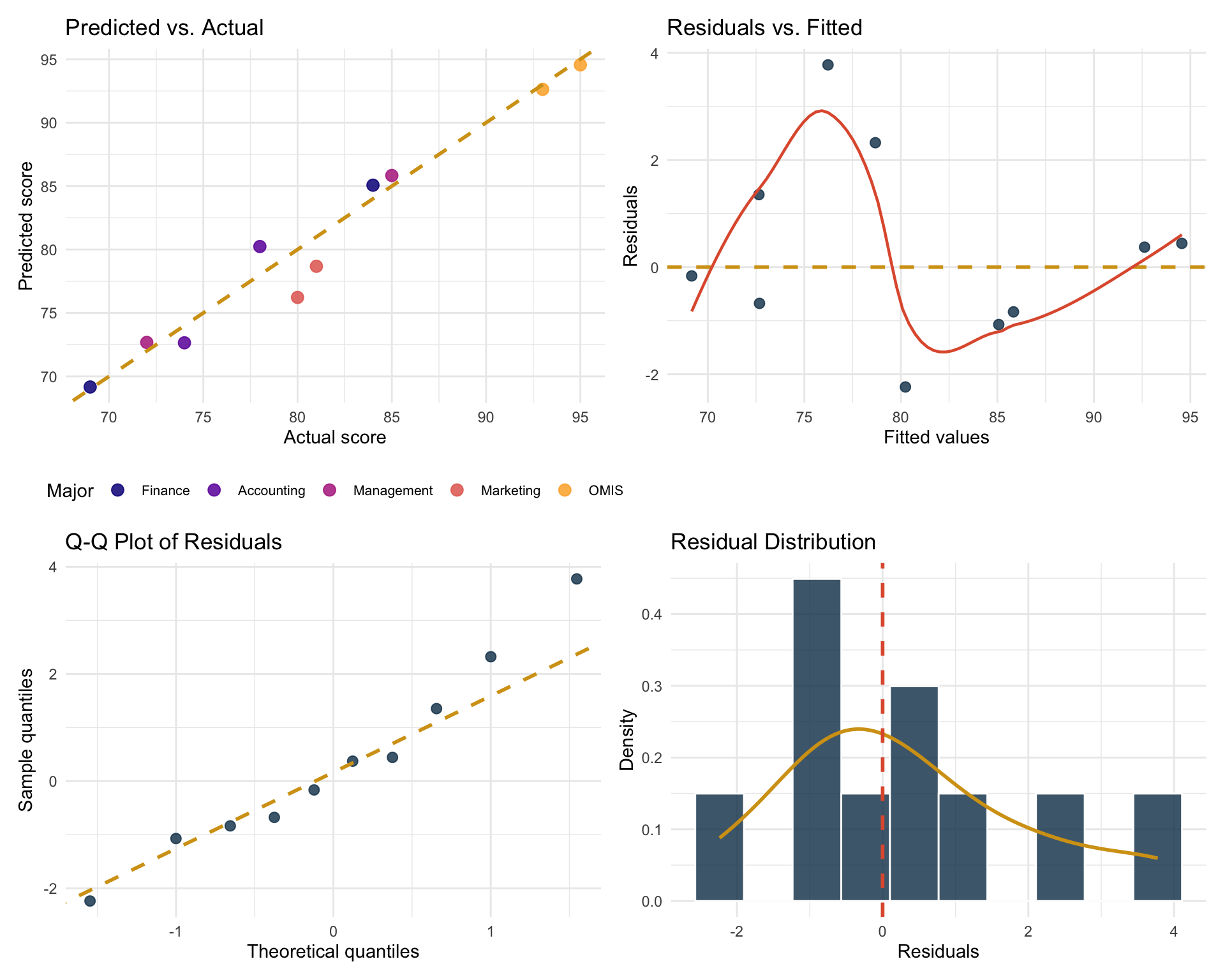
2.7 Diagnostic charts
Good analysts do not stop at metrics — they look at the residuals.
Code
# 1 · Predicted vs Actual (Covered in Class)p1 <- preds |>ggplot(aes(x = final_treasure, y = .pred)) +geom_point(aes(colour = major), size =3, alpha = .85) +geom_abline(slope =1, intercept =0,colour ="#d4a017", linewidth =1, linetype ="dashed") +scale_colour_viridis_d(option ="plasma", end = .82) +labs(title ="Predicted vs. Actual",x ="Actual score", y ="Predicted score",colour ="Major") +theme_minimal(base_size =11) +theme(legend.position ="bottom",legend.text =element_text(size =8))# 2 · Residuals vs Fitted (Covered in Class)p2 <- preds |>ggplot(aes(x = .pred, y = .resid)) +geom_point(colour ="#0b3954", size =2.5, alpha = .8) +geom_hline(yintercept =0, colour ="#d4a017",linewidth =1, linetype ="dashed") +geom_smooth(se =FALSE, colour ="#e05b3a",linewidth = .8, method ="loess", formula = y ~ x) +labs(title ="Residuals vs. Fitted",x ="Fitted values", y ="Residuals") +theme_minimal(base_size =11)# 3 · Q-Q plot of residuals (Not Covered in Class but Useful)p3 <- preds |>ggplot(aes(sample = .resid)) +stat_qq(colour ="#0b3954", size =2.5, alpha = .8) +stat_qq_line(colour ="#d4a017", linewidth =1, linetype ="dashed") +labs(title ="Q-Q Plot of Residuals",x ="Theoretical quantiles", y ="Sample quantiles") +theme_minimal(base_size =11)# 4 · Residuals distribution (Not Covered in Class but Useful)p4 <- preds |>ggplot(aes(x = .resid)) +geom_histogram(aes(y =after_stat(density)),fill ="#0b3954", colour ="white", bins =10, alpha = .8) +geom_density(colour ="#d4a017", linewidth =1) +geom_vline(xintercept =0, colour ="#e05b3a",linewidth =1, linetype ="dashed") +labs(title ="Residual Distribution",x ="Residuals", y ="Density") +theme_minimal(base_size =11)(p1 + p2) / (p3 + p4)
Four diagnostic charts for the fitted linear model
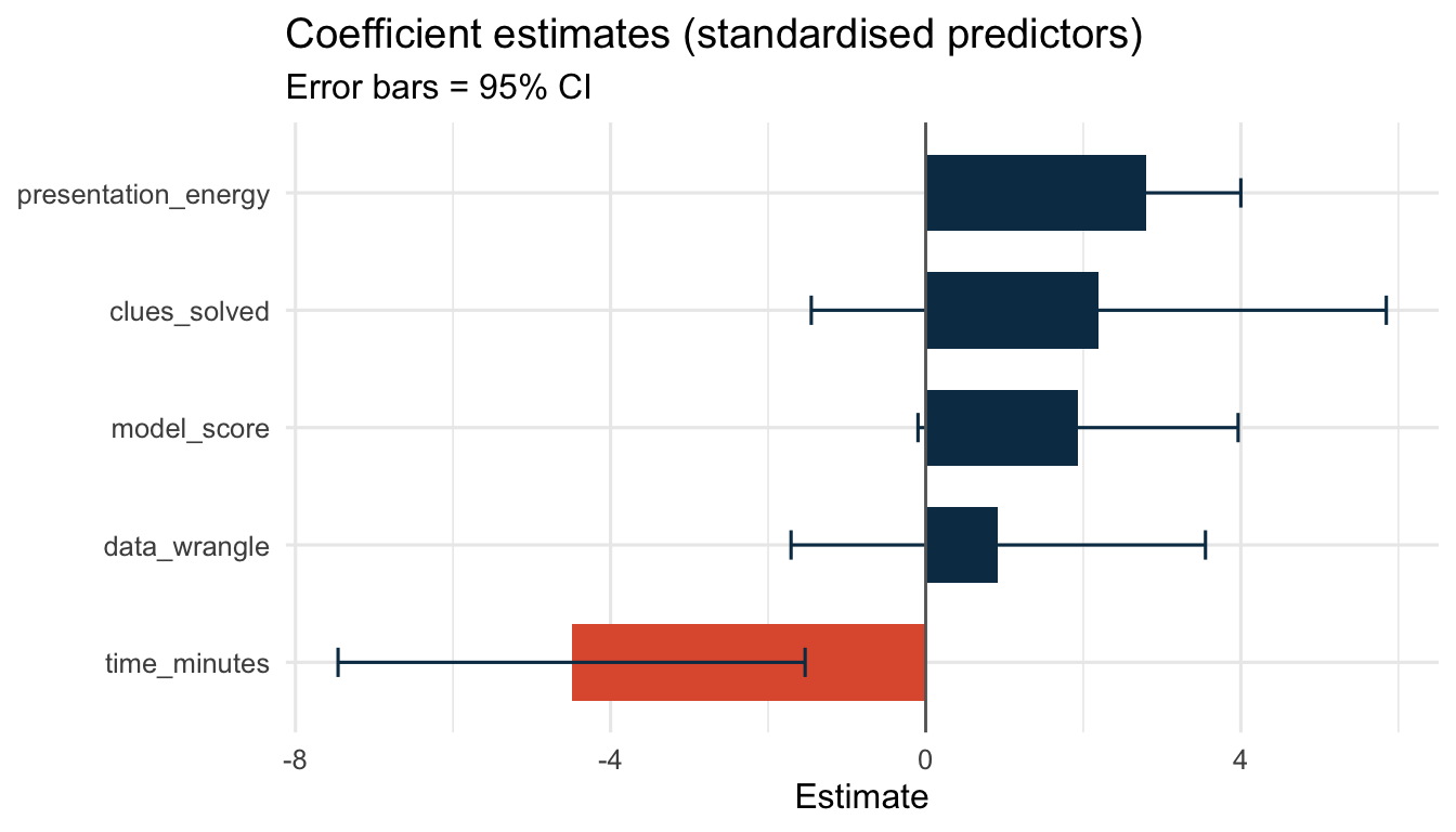
Which skills are most predictive of treasure recovery (standardised)?
💬 “Ask: which skill has the widest confidence interval? What does that tell us about certainty? A coefficient whose error bar crosses 0 is not reliably different from ‘no effect’. This was not covered in class but it can be useful beyond the class.”
2.9 Reflection prompts
Which variable appears most predictive of treasure score?
Do the residual plots suggest the linear reg model is appropriate for this data?
How would you explain RMSE or MAE to a manager who does not know statistics?
What would you change before showing this analysis to a client?
---title: "📊 Stages 2 & 3 · Exploratory Data Analysis + Tidymodels"subtitle: "~25 minutes · The heart of the toolkit"format: html: toc: true number-sections: trueexecute: echo: true warning: false message: false---::: {.instructor-note}**Instructor · Stages 2–3 (~25 min combined).** Render and open the HTML. Walk through EDA first (Stage 2, ~10 min) then the tidymodels section (Stage 3, ~10 min). Key narration cues are marked 💬 throughout.:::<div class="hero-banner"><h1>🔍 Stages 2 & 3 · Read the Evidence · Model the Pattern</h1><p>A reproducible analysis keeps code and conclusions in the same file.<br>Every number, every chart, every model update is one <code>render</code> away.</p></div>---## Setup```{r}library(tidyverse)library(tidymodels)library(patchwork)library(GGally)treasure <-read_csv("data/treasure_hunt.csv", show_col_types =FALSE) |>mutate(major =fct_reorder(major, final_treasure, .fun = mean))glimpse(treasure)```::: columns::: {.column width="65%"}💬 *"`glimpse()` is the first thing I run on any dataset. It tells me variable types, dimensions, and a data preview in a compact format — faster than scrolling through Excel."*:::::: {.column width="33%"}<img src="https://pplx-res.cloudinary.com/image/upload/pplx_search_images/2059be7828666c807fc8fd07579a9bd437dbbed6.jpg" alt="RStudio interface" style="border-radius:12px; box-shadow:0 6px 16px rgba(0,0,0,.13); width:100%;">::::::---# Stage 2 · Exploratory Data Analysis## Summary statistics```{r}treasure |>summarise(across(where(is.numeric),list(n = \(x) sum(!is.na(x)),min = \(x) min(x, na.rm =TRUE),mean = \(x) round(mean(x, na.rm =TRUE), 2),median = \(x) median(x, na.rm =TRUE),max = \(x) max(x, na.rm =TRUE),sd = \(x) round(sd(x, na.rm =TRUE), 2) ),.names ="{.col}__{.fn}" ) ) |>pivot_longer(everything(),names_to =c("variable", "stat"),names_sep ="__" ) |>pivot_wider(names_from = stat,values_from = value )```💬 *"Summary statistics are the first conversation with your data. Look for min/max outliers, and notice whether the mean and median are close — a big gap hints at skew."*## Per-major summary```{r}major_summary <- treasure |>group_by(major) |>summarise(n =n(),# final_treasuremin_treasure =min(final_treasure, na.rm =TRUE),mean_treasure =round(mean(final_treasure, na.rm =TRUE), 1),median_treasure =median(final_treasure, na.rm =TRUE),max_treasure =max(final_treasure, na.rm =TRUE),sd_treasure =round(sd(final_treasure, na.rm =TRUE), 1),# clues_solvedmin_clues =min(clues_solved, na.rm =TRUE),mean_clues =round(mean(clues_solved, na.rm =TRUE), 1),median_clues =median(clues_solved, na.rm =TRUE),max_clues =max(clues_solved, na.rm =TRUE),sd_clues =round(sd(clues_solved, na.rm =TRUE), 1),# time_minutesmin_time_min =min(time_minutes, na.rm =TRUE),mean_time_min =round(mean(time_minutes, na.rm =TRUE), 1),median_time_min =median(time_minutes, na.rm =TRUE),max_time_min =max(time_minutes, na.rm =TRUE),sd_time_min =round(sd(time_minutes, na.rm =TRUE), 1),.groups ="drop" ) |>arrange(desc(mean_treasure))major_summary```## Distributions```{r fig.width=9, fig.height=4}#| fig-cap: "Distribution of final treasure scores (left) and clues solved (right)"p1 <- treasure |> ggplot(aes(x = final_treasure)) + geom_histogram(fill = "#0b3954", colour = "white", bins = 12) + geom_vline(xintercept = mean(treasure$final_treasure), colour = "#d4a017", linewidth = 1, linetype = "dashed") + annotate("text", x = mean(treasure$final_treasure) + 2, y = 4.5, label = "mean", colour = "#d4a017", size = 3.5) + labs(title = "Final treasure score", x = "Score", y = "Count") + theme_minimal(base_size = 12)p2 <- treasure |> ggplot(aes(x = clues_solved)) + geom_histogram(fill = "#e05b3a", colour = "white", bins = 8) + labs(title = "Clues solved", x = "Clues", y = "Count") + theme_minimal(base_size = 12)p1 + p2```💬 *"The dashed line is the mean. Is the distribution roughly symmetric or skewed? Skew affects which summary statistic is most meaningful."*## Score distribution by major```{r fig.width=8, fig.height=5}#| fig-cap: "Treasure score by major — dots show individual teams"treasure |> ggplot(aes(x = major, y = final_treasure, fill = major)) + geom_boxplot(alpha = 0.6, outlier.shape = NA, width = 0.5) + geom_jitter(aes(colour = major), width = 0.12, size = 2.5, alpha = 0.85) + scale_fill_viridis_d(option = "plasma", end = .82) + scale_colour_viridis_d(option = "plasma", end = .82) + labs( title = "Treasure score distribution by major", x = NULL, y = "Final treasure score" ) + theme_minimal(base_size = 12) + theme(legend.position = "none")```💬 *"Box plots show spread and median. The jittered dots show every individual team. Ask: which major has the highest median? Which has the most variability?"*## Ranked bar chart```{r fig.width=7, fig.height=4}#| fig-cap: "Average final treasure score by major"major_summary |> ggplot(aes(x = mean_treasure, y = major, fill = mean_treasure)) + geom_col(show.legend = FALSE, width = .65) + geom_text(aes(label = mean_treasure), hjust = -.2, size = 3.8, colour = "#2c2c2c") + geom_errorbarh( aes(xmin = mean_treasure - sd_treasure, xmax = mean_treasure + sd_treasure), height = .25, colour = "#0b3954", linewidth = .7 ) + scale_fill_gradient(low = "#8ecae6", high = "#023047") + scale_x_continuous(limits = c(0, 108)) + labs(title = "Average treasure score ± 1 SD", x = "Score", y = NULL) + theme_minimal(base_size = 12) + theme(panel.grid.major.y = element_blank())```## Pair plot — all numeric variables```{r fig.width=9, fig.height=8}#| fig-cap: "Pair plot: correlations and scatterplots for all numeric features"treasure |> select(clues_solved, time_minutes, data_wrangle, model_score, presentation_energy, final_treasure) |> ggpairs( upper = list(continuous = wrap("cor", size = 3.5)), lower = list(continuous = wrap("points", alpha = 0.5, size = 1.5, colour = "#0b3954")), diag = list(continuous = wrap("densityDiag", fill = "#d4a017", alpha = .4)) ) + theme_minimal(base_size = 10)```💬 *"The pair plot shows everything at once: histograms on the diagonal, scatter plots below, correlation coefficients above. The strongest predictors of `final_treasure` are immediately visible."*<div class="clue-box">🏴☠️ <strong>Fragment #2:</strong> The practice of keeping code and conclusions together so neither ever drifts from the other is called <strong>reproducible</strong> analysis.</div>---# Stage 3 · Tidymodels — Fit + Diagnose::: columns::: {.column width="64%"}## The tidymodels workflowEvery tidymodels pipeline follows the same chain:```split → recipe → model spec → workflow → fit → predict → evaluate → diagnose```What makes it powerful is that **every step is explicit and interchangeable**. Swap the model spec (linear → random forest), and the rest of the pipeline stays identical.:::::: {.column width="34%"}<img src="https://pplx-res.cloudinary.com/image/upload/pplx_search_images/7978801773ef3c50569c919369fe697b971ade30.jpg" alt="Golden key unlocking treasure" style="border-radius:12px; box-shadow:0 6px 16px rgba(0,0,0,.12); width:100%; margin-top:.5rem;">::::::## Split```{r}set.seed(482)split_obj <-initial_split(treasure, prop =0.75, strata = major)train_data <-training(split_obj)test_data <-testing(split_obj)cat("Training rows:", nrow(train_data), "| Test rows:", nrow(test_data))```## Recipe```{r}treasure_recipe <-recipe( final_treasure ~ clues_solved + time_minutes + data_wrangle + model_score + presentation_energy,data = train_data) |>step_normalize(all_numeric_predictors())treasure_recipe```💬 *"The recipe is a preprocessing blueprint. `step_normalize` ensures all predictors are on the same scale before fitting. The recipe has not 'done' anything yet — it's a plan."*## Model specification```{r}lm_spec <-linear_reg() |>set_engine("lm") |>set_mode("regression")lm_spec```## Workflow — assemble + fit```{r}lm_workflow_fitted <-workflow() |>add_recipe(treasure_recipe) |>add_model(lm_spec)|>fit(train_data)lm_workflow_fitted |>tidy() |>arrange(desc(abs(estimate)))```## Test-set evaluation```{r}preds <-predict(lm_workflow_fitted, new_data= test_data) |>bind_cols(test_data) |>mutate(.resid = final_treasure - .pred)metrics(preds, truth = final_treasure, estimate = .pred)```💬 *"RMSE is in the same units as the target variable. RSQ tells us proportion of variance explained. Ask a student: is this a good model for a real hiring decision?"*---## Diagnostic chartsGood analysts do not stop at metrics — they **look at the residuals**.```{r fig.width=10, fig.height=8}#| fig-cap: "Four diagnostic charts for the fitted linear model"# 1 · Predicted vs Actual (Covered in Class)p1 <- preds |> ggplot(aes(x = final_treasure, y = .pred)) + geom_point(aes(colour = major), size = 3, alpha = .85) + geom_abline(slope = 1, intercept = 0, colour = "#d4a017", linewidth = 1, linetype = "dashed") + scale_colour_viridis_d(option = "plasma", end = .82) + labs(title = "Predicted vs. Actual", x = "Actual score", y = "Predicted score", colour = "Major") + theme_minimal(base_size = 11) + theme(legend.position = "bottom", legend.text = element_text(size = 8))# 2 · Residuals vs Fitted (Covered in Class)p2 <- preds |> ggplot(aes(x = .pred, y = .resid)) + geom_point(colour = "#0b3954", size = 2.5, alpha = .8) + geom_hline(yintercept = 0, colour = "#d4a017", linewidth = 1, linetype = "dashed") + geom_smooth(se = FALSE, colour = "#e05b3a", linewidth = .8, method = "loess", formula = y ~ x) + labs(title = "Residuals vs. Fitted", x = "Fitted values", y = "Residuals") + theme_minimal(base_size = 11)# 3 · Q-Q plot of residuals (Not Covered in Class but Useful)p3 <- preds |> ggplot(aes(sample = .resid)) + stat_qq(colour = "#0b3954", size = 2.5, alpha = .8) + stat_qq_line(colour = "#d4a017", linewidth = 1, linetype = "dashed") + labs(title = "Q-Q Plot of Residuals", x = "Theoretical quantiles", y = "Sample quantiles") + theme_minimal(base_size = 11)# 4 · Residuals distribution (Not Covered in Class but Useful)p4 <- preds |> ggplot(aes(x = .resid)) + geom_histogram(aes(y = after_stat(density)), fill = "#0b3954", colour = "white", bins = 10, alpha = .8) + geom_density(colour = "#d4a017", linewidth = 1) + geom_vline(xintercept = 0, colour = "#e05b3a", linewidth = 1, linetype = "dashed") + labs(title = "Residual Distribution", x = "Residuals", y = "Density") + theme_minimal(base_size = 11)(p1 + p2) / (p3 + p4)```::: {.callout-important}## How to read these four charts| Chart | What a good model looks like | Red flag ||---|---|---|| **Predicted vs Actual** | Dots close to the dashed diagonal | Systematic curve above/below diagonal || **Residuals vs Fitted** | Dots scattered randomly around 0 | U-shape or funnel (heteroscedasticity) || **Q-Q Plot** | Dots follow the dashed line | Heavy tails or S-curve pattern || **Residual Distribution** | Bell-shaped, centred on 0 | Skew or multimodality |:::## Coefficient plot```{r fig.width=7, fig.height=4}#| fig-cap: "Which skills are most predictive of treasure recovery (standardised)?"lm_workflow_fitted |> tidy() |> filter(term != "(Intercept)") |> ggplot(aes(x = estimate, y = fct_reorder(term, estimate))) + geom_col(aes(fill = estimate > 0), show.legend = FALSE, width = .65) + geom_errorbarh( aes(xmin = estimate - std.error * 1.96, xmax = estimate + std.error * 1.96), height = .25, colour = "#0b3954" ) + geom_vline(xintercept = 0, linewidth = .5, colour = "grey40") + scale_fill_manual(values = c("#e05b3a", "#0b3954")) + labs( title = "Coefficient estimates (standardised predictors)", subtitle = "Error bars = 95% CI", x = "Estimate", y = NULL ) + theme_minimal(base_size = 12)```💬 *"Ask: which skill has the widest confidence interval? What does that tell us about certainty? A coefficient whose error bar crosses 0 is not reliably different from 'no effect'. This was not covered in class but it can be useful beyond the class."*---## Reflection prompts1. Which variable appears most predictive of treasure score?2. Do the residual plots suggest the linear reg model is appropriate for this data?3. How would you explain RMSE or MAE to a manager who does not know statistics?4. What would you change before showing this analysis to a client?Continue to **[📽️ Stage 4: Slides](slides.qmd)**<img src="https://media4.giphy.com/media/v1.Y2lkPTc5MGI3NjExODV5NDVhc3NrcjNoYTdlbjc0dm9mZnVwMG5mczJxN3B1azJ1N2wyNSZlcD12MV9pbnRlcm5hbF9naWZfYnlfaWQmY3Q9Zw/1Ctu1BCYf21we9tRmT/giphy.gif" alt="Pirate coding gif" class="gif-center">