~12 minutes · Collect the fragments · Claim the Toolkit
Instructor · Stage 5 (~12 min). Bring the class back together. Read each fragment aloud. Run the class debrief. Close with the Golden Data Toolkit reveal.
🏆 The Final Chamber
Four doors. Four fragments. One toolkit. You have passed through all of them.
The data analyst/scientist who writes Quarto documents, clicks render, builds reproducibly, explores with EDA and analyze with tidymodels, and publishes for others — holds the Golden Data Toolkit.
The toolkit in plain language
🗺 Quarto
You tell the tool what you want. One document, endless outputs. More importantly you can easily combine code with text descriptions.
⚙️ Render
You do not export, copy, or paste. You run one command and the document builds itself.
🔁 Reproducible
Your conclusions are inseparable from the code that produced them. No one can question whether you manually adjusted the chart.
🔍 EDA
You look at the data before you model it. Distributions, correlations, outliers — the data has a story before you impose a model on it.
🔍 Tidymodels
You model the data you explored and make predictions. You then evaluate those models to identify the best/most optimal model.
📤 Publish
Analysis that stays on your laptop has no value. Quarto makes sharing as easy as rendering. At this point you can communicate your results as a dynamic report or slides depending on your stakeholders.
Try quarto::quarto_render("report.qmd", output_format = "pdf") — same file, different format
# Publish to QuartoPub (free)quarto::quarto_publish_site()
Source Code
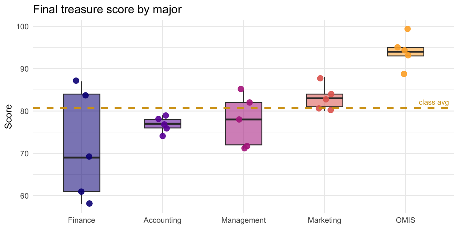
---title: "🏆 Stage 5 · The Final Chamber"subtitle: "~12 minutes · Collect the fragments · Claim the Toolkit"format: html: toc: trueexecute: echo: true warning: false message: false---::: {.instructor-note}**Instructor · Stage 5 (~12 min).** Bring the class back together. Read each fragment aloud. Run the class debrief. Close with the Golden Data Toolkit reveal.:::<div class="hero-banner"><h1>🏆 The Final Chamber</h1><p>Four doors. Four fragments. One toolkit.<br>You have passed through all of them.</p></div>---## The four fragments — assembled```{r}library(tidyverse)fragments <-tibble(number =paste0("#", 0:5),source =c("index.qmd — freebie", "demo.qmd", "report.qmd","report.qmd (EDA)","report.qmd (tidymodels)", "slides.qmd"),word =c("Quarto", "Render", "Reproducible", "EDA", "Tidymodels", "Publish"))fragments```::: {.clue-box}🏴☠️ **The six words, in order:**> **Quarto · render · reproducible · EDA · tidymodels · publish**The data analyst/scientist who writes **Quarto** documents, clicks **render**, builds **reproducibly**, explores with **EDA** and analyze with **tidymodels**, and **publishes** for others — holds the Golden Data Toolkit.:::---## The toolkit in plain language::: {.treasure-card}### 🗺 QuartoYou tell the tool what you want. One document, endless outputs. More importantly you can easily combine code with text descriptions.:::::: {.treasure-card}### ⚙️ RenderYou do not export, copy, or paste. You run one command and the document builds itself.:::::: {.treasure-card}### 🔁 ReproducibleYour conclusions are inseparable from the code that produced them. No one can question whether you manually adjusted the chart.:::::: {.treasure-card}### 🔍 EDAYou look at the data before you model it. Distributions, correlations, outliers — the data has a story before you impose a model on it.:::::: {.treasure-card}### 🔍 TidymodelsYou model the data you explored and make predictions. You then evaluate those models to identify the best/most optimal model.:::::: {.treasure-card}### 📤 PublishAnalysis that stays on your laptop has no value. Quarto makes sharing as easy as rendering. At this point you can communicate your results as a dynamic report or slides depending on your stakeholders.:::---## Final scoreboard```{r fig.width=7, fig.height=4}treasure <- read_csv("data/treasure_hunt.csv", show_col_types = FALSE) |> mutate(major = fct_reorder(major, final_treasure, .fun = mean))treasure |> group_by(major) |> summarise( avg_score = round(mean(final_treasure), 1), top_score = max(final_treasure), n_teams = n(), .groups = "drop" ) |> arrange(desc(avg_score)) |> mutate(rank = row_number(), medal = c("🥇", "🥈", "🥉", "🎖️", "🎖️")) |> select(medal, major, avg_score, top_score, n_teams)``````{r fig.width=8, fig.height=4}#| fig-cap: "Where every team landed"treasure |> ggplot(aes(x = major, y = final_treasure, fill = major)) + geom_boxplot(alpha = 0.55, outlier.shape = NA, width = 0.45) + geom_jitter(aes(colour = major), width = 0.1, size = 3, alpha = .9) + geom_hline(yintercept = mean(treasure$final_treasure), colour = "#d4a017", linewidth = 1, linetype = "dashed") + annotate("text", x = 5.35, y = mean(treasure$final_treasure) + 1.5, label = "class avg", colour = "#d4a017", size = 3.2) + scale_fill_viridis_d(option = "plasma", end = .82) + scale_colour_viridis_d(option = "plasma", end = .82) + labs(title = "Final treasure score by major", x = NULL, y = "Score") + theme_minimal(base_size = 12) + theme(legend.position = "none")```---## Class debrief::: {.callout-tip}## Discussion prompts — pick 2 or 31. *"What would happen to a report you built last semester if the raw data changed?"*2. *"When would you choose a website over a PDF?"*3. *"What is the business value of reproducibility in a professional setting?"*4. *"Which part of today's workflow surprised you most?"*5. *"Where — internship, job, grad school — would this toolkit matter most for you personally?"*:::---## The Golden Data Toolkit — revealed<div class="hero-banner"><h2>🏆 The Golden Data Toolkit is yours</h2><p>It is not a file. It is not a package.<br>It is a workflow.<br><br><strong>Analyse once. Render to anything. Share reproducibly.</strong><br><br>You have been building it all semester. Today you just learned to name it.</p></div><div style="text-align:center;"><img src="https://media.giphy.com/media/4JUdRonaQA0kklmL1W/giphy.gif" alt="Treasure chest opens — golden light" class="gif-center"></div>---## What to do next (optional extensions)- Leverage additional models. For example, compare the linear model with a random forest. Then determine the best model.- Add a `communicate.qmd` page to the website with your own EDA and tidymodels insight- Publish the site to [Quarto Pub](https://quartopub.com) — free, one command or [Github Pages](https://docs.github.com/en/pages).- Try `quarto::quarto_render("report.qmd", output_format = "pdf")` — same file, different format```r# Publish to QuartoPub (free)quarto::quarto_publish_site()```<img src="https://media4.giphy.com/media/v1.Y2lkPTc5MGI3NjExODV5NDVhc3NrcjNoYTdlbjc0dm9mZnVwMG5mczJxN3B1azJ1N2wyNSZlcD12MV9pbnRlcm5hbF9naWZfYnlfaWQmY3Q9Zw/1Ctu1BCYf21we9tRmT/giphy.gif" alt="Pirate coding gif" class="gif-center">